Tuesday 3 July 2012

Digital Media with studio production


 Digital Media with studio production

This project was built in mind to use new technology to present and visualize arts in a professional way.
For digital media I used 3D Max program to produce the visualization of the space where I would present the work that was produced a long this two years of university.

In my opinion I was able to produce an image that is closer to reality, there are some small points that was far from reality due to not having a lot of practice in this program. I learned the basics of 3D Max program on my work experience only now had the opportunity to put my skills to use with a real live situation, but I’m quite happy with the end result I understand to get perfection with this program I have to practice and practice without stopping.

To demonstrate the process that it takes to build the space in 3D Max where my work would be exposed at Southgate College hall, I built a small video in the program Camtasio Studio with a soundtrack which demonstrates the process from the first wall until the last light.

This project was very hard and time consuming because it involved other programs and other works from deferent projects, I think I have achieve a good result because I adventure in new programs to achieve my end results.


Saturday 26 May 2012

Personal Research Project ( research)

I created a mood board  with the work of these great artists ...
As you can see they have great influences in my work.


Image 1: I started my research by looking into the different types of typography and colours. Then I mixed then all together as an experiment to see what kind of effect I would get, and this is the result.
Image 2:  I played with the size of the letters and moved them behind the background to see the kind of effect I would get.


 Image 3 & 4: I started working on a different logo, after doing small Google search to find out avability and I found out that already existed a graphic design with those initials , and I decided to go with AnaIsee Design :) . I used the colourful background from my first typography research and combined it with the letters to see the type of effect I would get.
Image 5: Another experimentation with the colourful typography; filling the letters with black and merging it with the background typography.

Image 6 & 7: In this image, I tried to fill the background with the main logo anaIsee design in small letters to experiment with the colours black and white.


 Image 8: Same experiment as the above images but with different size letters and the background the writing in different spaces instead of been aligned. 


Personal Research

I have been working on this new project , that so far I am running a bit late. The aim of this project is to make you think and work as if it was a real live work situation ...

So I started the research in my area of interest, which is Graphic Design. However, as people know, this is a very big area so I found myself with a lot of material to work with. I wasn't sure which area to concentrate on. I realized that my research was similar to my previous project Another Skin (in that project I created a magazine).  Using my previous project as inspiration, I began researching for how to advertise so I could put my magazine in the market. I realised before I do all of that I needed to make people recognize who made the magazine, or at least have on the market have an identity registered as a graphic designer. So this Personal research project ended up been a very personal topic.

First I started by looking and thinking towards what I wanted as Graphic designer. I came to the conclusion that I want to make my name my brand my logo, with this logo being something that people want to have in t-shirts, cards and posters. So I commenced looking into what the big brands we know for our generation and that we recognize for their typography, colours or images related to their logo. I initiated with researching brand names. What I researched included: what they mean, and how it was generated... I looked at their colours and the reasons why they choose those colours.
After this research topic, I started looking into what I want my logo to look like, keeping in mind the brand research I conducted.


On my tries to create my logo you can see the influences of the artists that I researched to help this project. For example you will see the influence of David Carson and Jonathan Barnbrook.


Monday 16 April 2012

PERSONAL RESEARCH

 Graphic design
Project proposal


Project proposal
With this project I want to look in to graphic design.
I want research a little bit more about some of the designers for example Jonathan Barnbrook, David Carson.
I will look into different angles of graphics design. For example a bit of history, designers influences through the years until now, and who was behind the best designs. What cultural influences are evident through the decades?
Work schedule 
Produce a detailed research to present on the 29th of February 2012.
Create a detail day by day work schedule with targets to meet every day.
Technology & Law
I am presenting my work and produce using different types of technology.
Law: I will search the laws involved in protecting different works and the Intellectual Property and relevant Acts that have an effect on creative responses.
Presentation
On the presentation I will have the final outcome of my research, using physical product to help engage the audience. The visual and written explanation will be on Camtasio Studio program to show my work and I will use the sketchbook explaining my explorations and ideas.

Assignment aims

  • To develop a knowledge I will be showing my research methods and historical background. According to graphic design and designers.

 •
  • I will prepare a presentation in different modes, using technology for example Camtasia Studio program, Photoshop and others. During my presentation I intend to help the audience to interact with my work. I will also use my sketchbook to demonstrate the processes of my work, alongside physical examples of the processes of work researched and development of my design ideas. I will show the production and the final outcome.


Saturday 18 February 2012

Copyrights

If you want to know how to protect your work ?
Give a look to this website you can find a bit of everything to help you with your future..
http://unihub.mdx.ac.uk/study/copyright/copy/index.aspx
I hope it can help you guys.....

`Paper quality affects reader perceptions.`

I was doing my search about paper for my magazine and I came a cross this web site that talks about how the paper quality can affect a reader perceptions. Im going to leave the articule in here for who is intrested :) enjoy your reading...

ARTICULE EXTRACTED FROM: http://www.fipp.com/News.aspx?PageIndex=2002&ItemId=12396

Paper quality affects reader perceptions of magazines and their ads, says M-Real's Reader Preference Research


Readers experience printed matter in more complex ways than is generally thought, and paper adds an extra dimension to that experience. This is the conclusion of a programme of research in Finland called Reader Preference Research, undertaken by M-real Corporation, the paper & paperboard company, in conjunction with the University of Helsinki’s Department of Psychology.
The report, published in summer 2004, concluded that paper has subconscious effects. It influences readers’ perceptions and preferences. People pay attention to images, and paper influences their perceptions of those images through the way it reproduces colour and details. The look and feel of the paper are important too.
The research included more than 2,000 respondents in focus groups, in seven different countries: Finland, Hungary, The Netherlands, Belgium, Germany, France and UK. Different kinds of publications were examined, especially women's magazines. Extensive quantitative research was also employed.
Although consumers were not told that paper was the core of the research, when they were shown the same photos printed on different types of paper, and asked how they perceived the atmosphere in the pictures, there were clear differences according to type of paper.
In one test the same advertisement for a watch was printed on different types of paper. 70% of participants thought one of the papers made the watch look more expensive, and emphasised its luxury. Paper and print quality also affect how much information is conveyed by product images. If the details stand out, readers can get a much better idea what a garment or piece of furniture will really look like.
The studies showed that readers will immediately notice any attempt to cut costs by using less than optimal paper. If they perceive that the paper is not appropriate, they may well extend this by association to the magazine itself.
Readers need to feel there is a good match between the publication and the paper. Readers form their image of a publication partially on the basis of the paper and print quality. While there may be more than one suitable type of paper for a given magazine, each gives subtly different nuances to the overall impression. The research found that readers tend to attach even more importance to the feel of the paper than the professionals do. This underlines the importance of giving focus groups the chance to evaluate alternative types of paper.
  • Magazine publishers should therefore ensure that they select paper which supports and enhances the magazine’s intended image and purpose. Paper is more than merely a medium for carrying messages: it should be used as a design element. This includes the tactile qualities of paper as well as its visual properties, because consumers attach a lot of importance to the feel of a publication.
  • Printers also play a vital role. One of the tests showed that it is the combination of paper and print quality that readers respond to. Comparing two printed samples, one was described as ‘cold’ and ‘flat’ while the other was ‘warm’ and ‘striking’: the difference was that the print quality of the first was not optimal. Colour management in printing is needed to achieve consistent, high quality results for a given paper.
  • To advertisers, this is a strong positive for the magazine medium: it provides a superb showcase for presenting their products.
The outcome of M-real’s programme of research fits in well with the conclusions of a UK study published in 2003. ‘Creative Format, Premium Impact’ (see review) was conducted by Rachel Lawes for the Periodical Publishers Association. It emphasised the importance of choice of paper – in this case, using special papers which are different from the normal magazine stock, in order to make the ad stand out even more. The report commented “the use of different weights and qualities of paper, embossing and other surface effects and textures, are effective ways to deliver impact. They have the ability to stop readers in their tracks. But they do more than that. They encourage interaction: something tactile that you’ve just got to touch or feel. Contemporary print and paper technology is the modern art of magazines. It is exciting, unpredictable and great for engaging young, affluent and style-conscious audiences.”

Financial

Monday 13 February 2012

This my enquire for another Another Skin


Hello everybody
I’m doing a very important project at university and I need to do some survey, that is where you guys came in to help if possible, I would like to ask just 3 question and if you could inbox me your individual answer that will be nice it only takes 5 minutes of your time.
If possible include your age.
I will be grateful for your help.
  1. What do you prefer as a quick form of information?
             a) Magazine
             b) Newspaper
             c) Poster

2.      What do you buy often?
a)      Magazine
b)      Newspaper
c)      Book

3.      Which type of magazine you buy and how much you pay?


Experiments

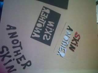
This is some of my typography exploration and experamentation for the project Another skin.:)
With colours, shapes and materials.


This is some of my typography exploration and experamentation for the project Another skin.:)